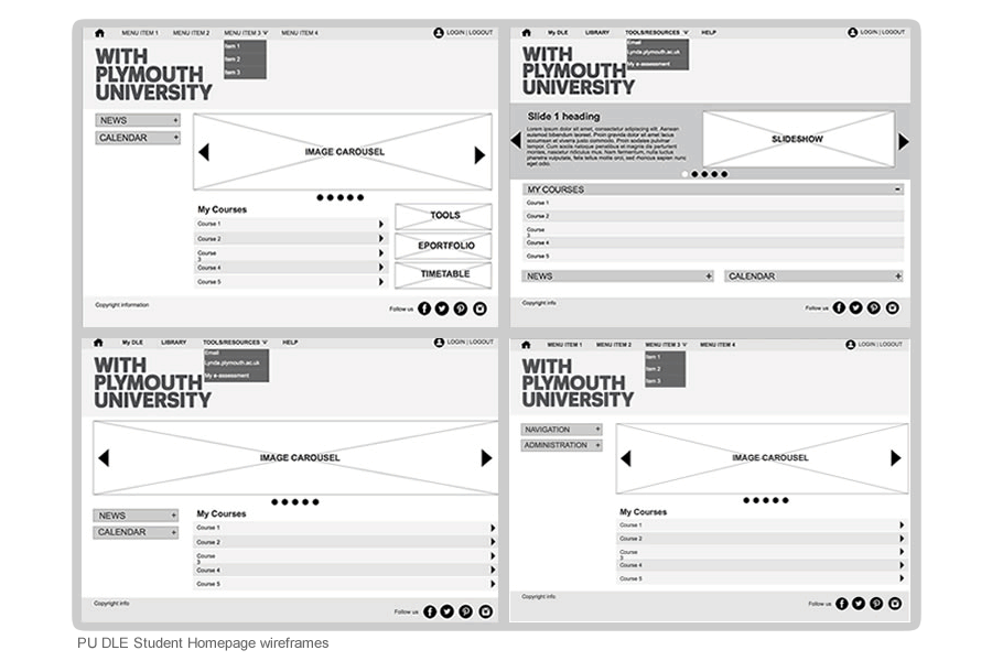
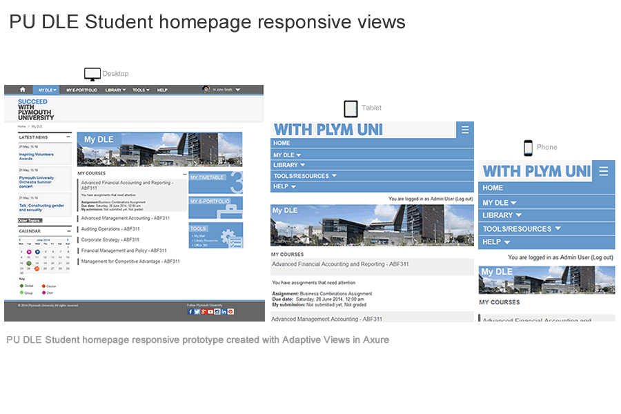
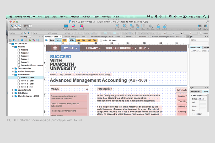
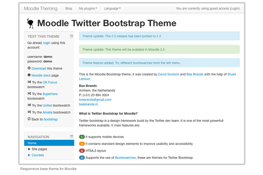
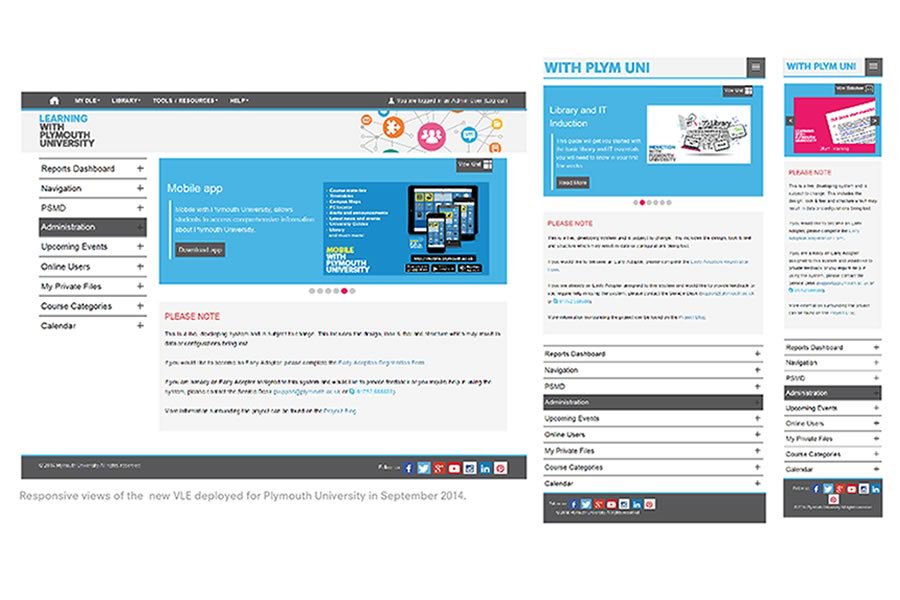
The objective of the project was to develop a Digital Learning Environment (DLE) that brings together a number of new and existing learning platforms and services to support and enhance the learning experience both for Plymouth University students and their academic research.
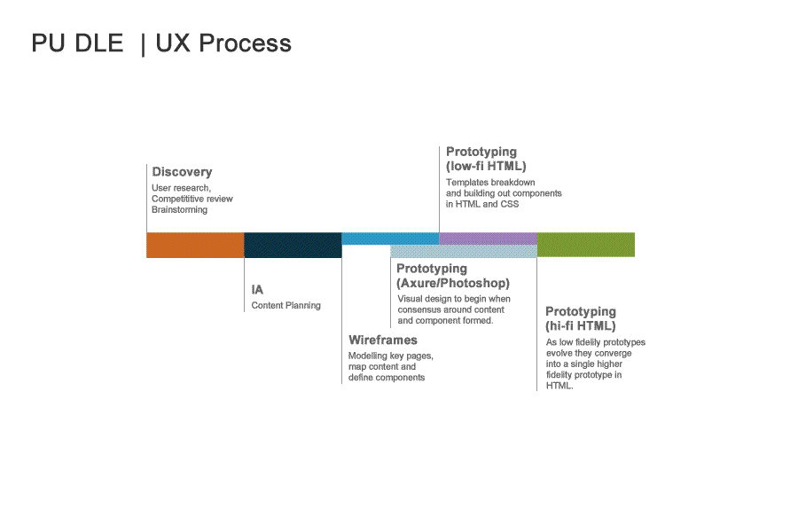
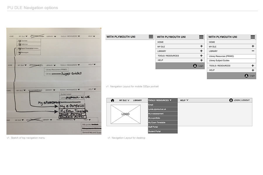
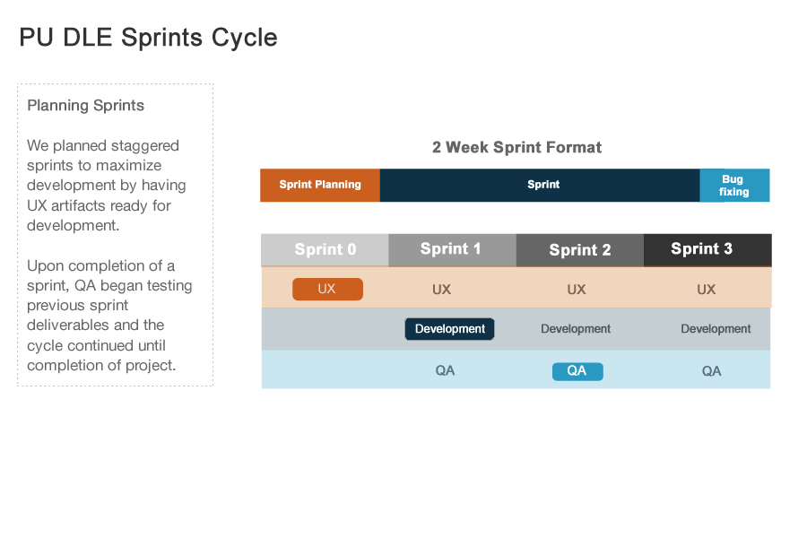
With the adoption of Agile in the development approach, integrating UX into an Agile workflow was a bit of a challenge.Because both UX and Agile was a new discipline at Plymouth and the development team there was a lot of trial and error before I was able to fit UX practices into this framework. The main problems I faced were related to the timing of agile UX activities - when it’s the best time to produce designs? how do we communicate these designs to the client and the rest of the team? how and when we fit usability testing?
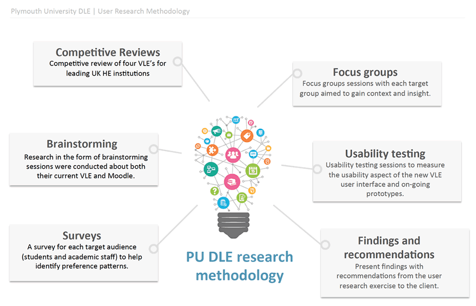
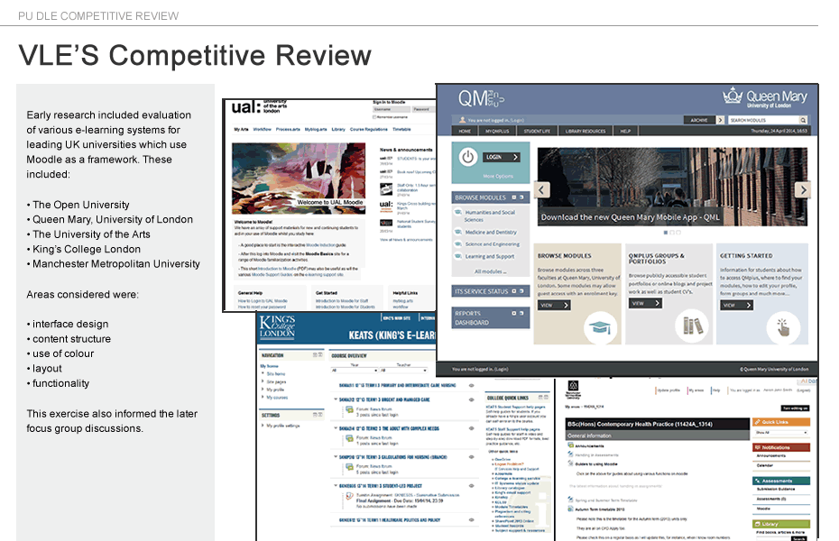
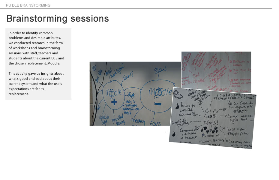
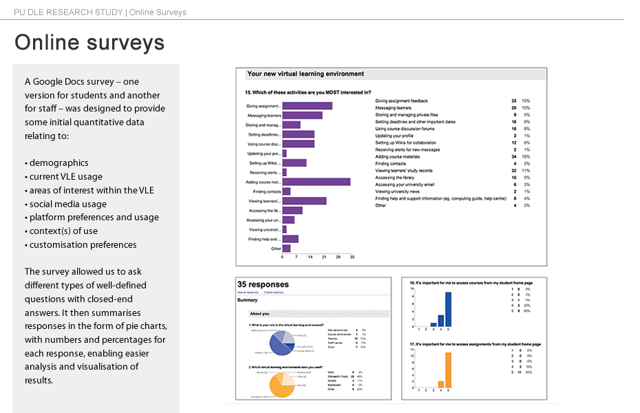
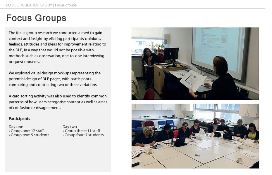
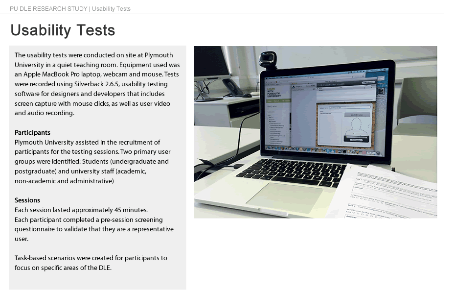
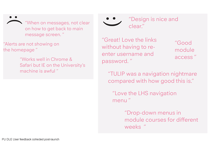
The project was implemented with a user-centered approach to design and development and, in line with this we carried out the user study research which included workshops, brainstorming sessions, focus groups and usability testing sessions involving students, academic staff and administrators.
Following the research phase, I created low fidelity wireframes of key site templates (e.g. VLE homepage, student homepage and course page). It then followed wireframes for smaller components such as standard and custom blocks developed for Plymouth. These were shared with the project team and amended following their feedback. They were also tested with users before entering the prototype production phase of the project.
In this project I’ve used a combination of prototyping techniques: browser prototyping with HTML and CSS, Photoshop for static elements and interactive prototyping using Adapting Views within a tool called Axure which allows you to create responsive prototypes without coding.
Bootstrap is a front-end framework designed to kickstart the front-end development of project web apps and websites. In this project I used a responsive theme based on the Bootstrap framework which I customised and developed as needed.
Having a responsive design includes having an optimised design for all of the prolific browsers, for the targeted devices and for performance. During development I was regularly testing for the target devices and browsers identified from web analytics on the client’s log files, as well as keeping an eye on performance. Based on initial poor performance results I used a number of front-end and server-side optimisation techniques to improve the performance of the learning environment.
Post launch was the time to collect feedback, measure and plan optimisation.
User feedback. Feedback from students was collected during the first month after the project was deployed. Students were asked to comment about their overall VLE experience, likes and dislikes.
Web Analytics. I collated and analysed the data identifying the interesting data and reported it back to the client in a format that was simple, clear and engaging. I stated the primary objectives, told the client my recommendations for future improvements based on what I learned from the analytics data.